Naming is one of the most collaborative and fun projects we do at Porchlight. It’s also one of the most extensive as we tend to leave no stone unturned. After exploring hundreds of ideas, the brand name IRONFORCE emerged as the clear winner, chosen for its ability to communicate strength, stability and lasting durability. These were, of course, the precise qualities that Berry wanted to convey.
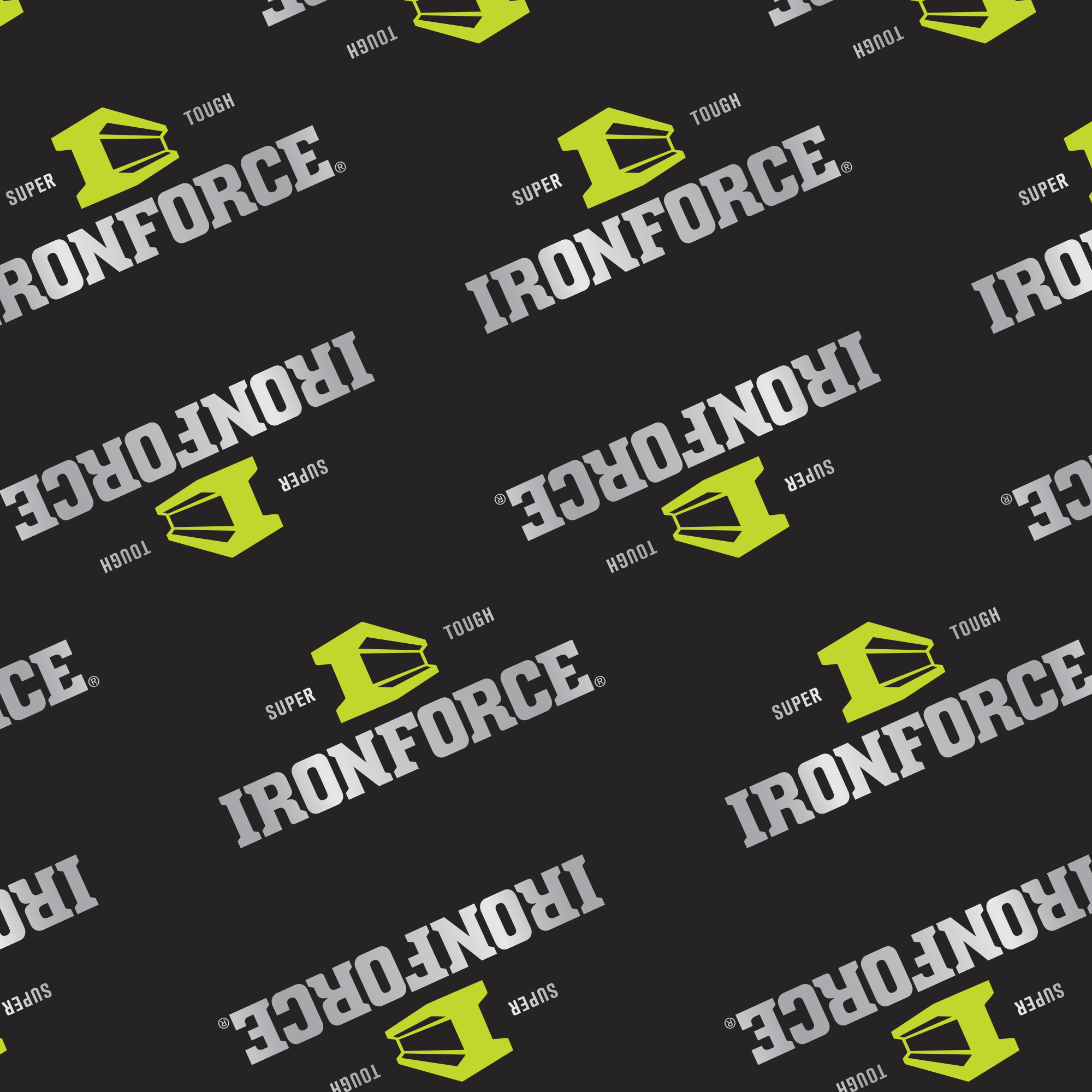
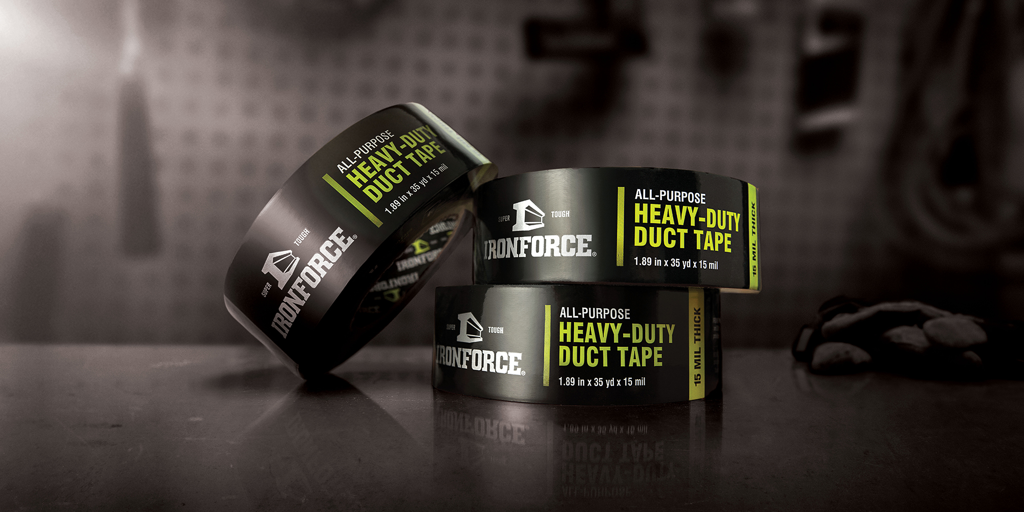
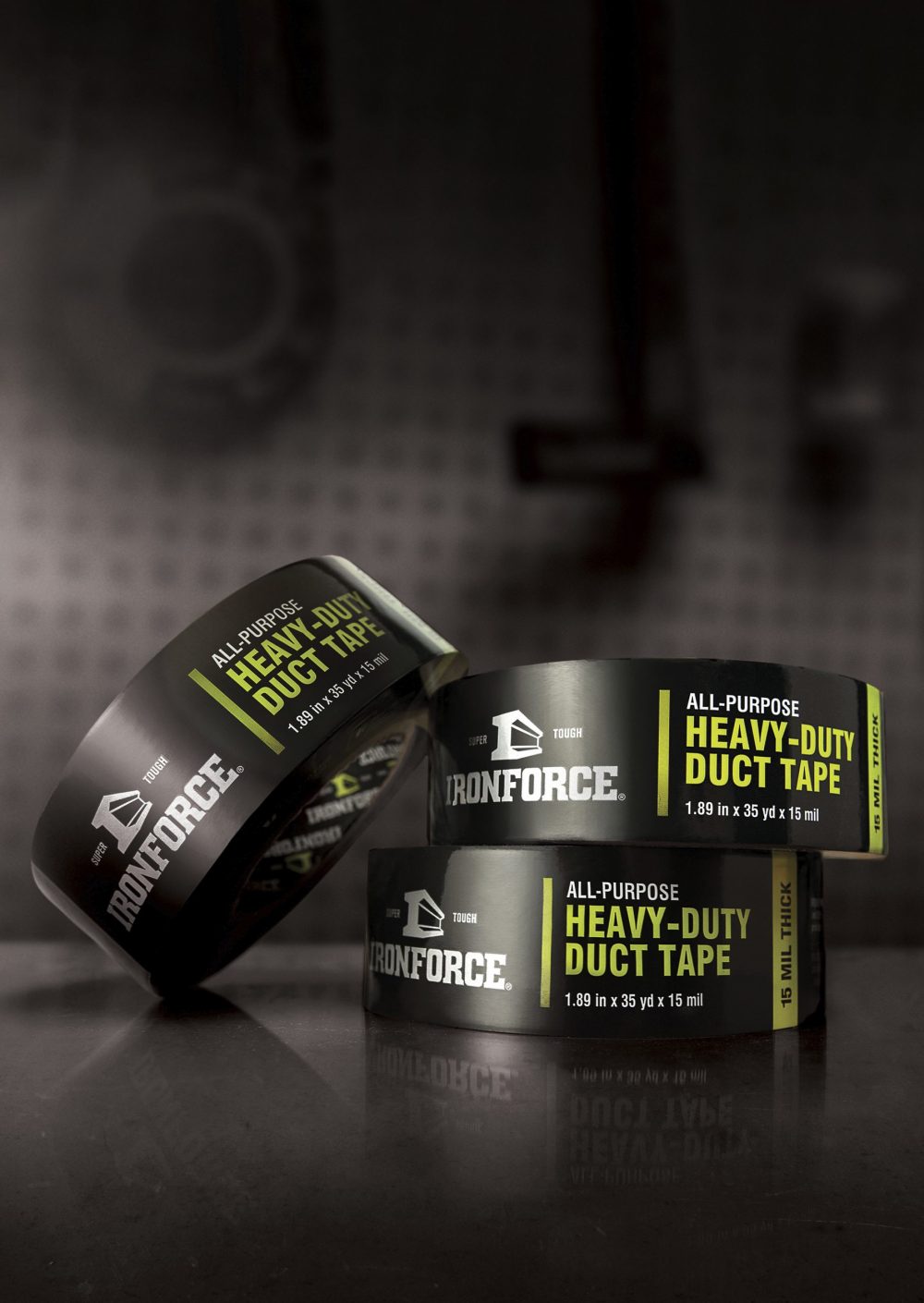
Once a name was confirmed, we turned our creative energy towards a visual identity to match the strength of the IRONFORCE name. One of many creative concepts considered, the iron support beam was chosen because of its industrial styling and representation of strength and durability. The final logo clearly communicates “built tough.”
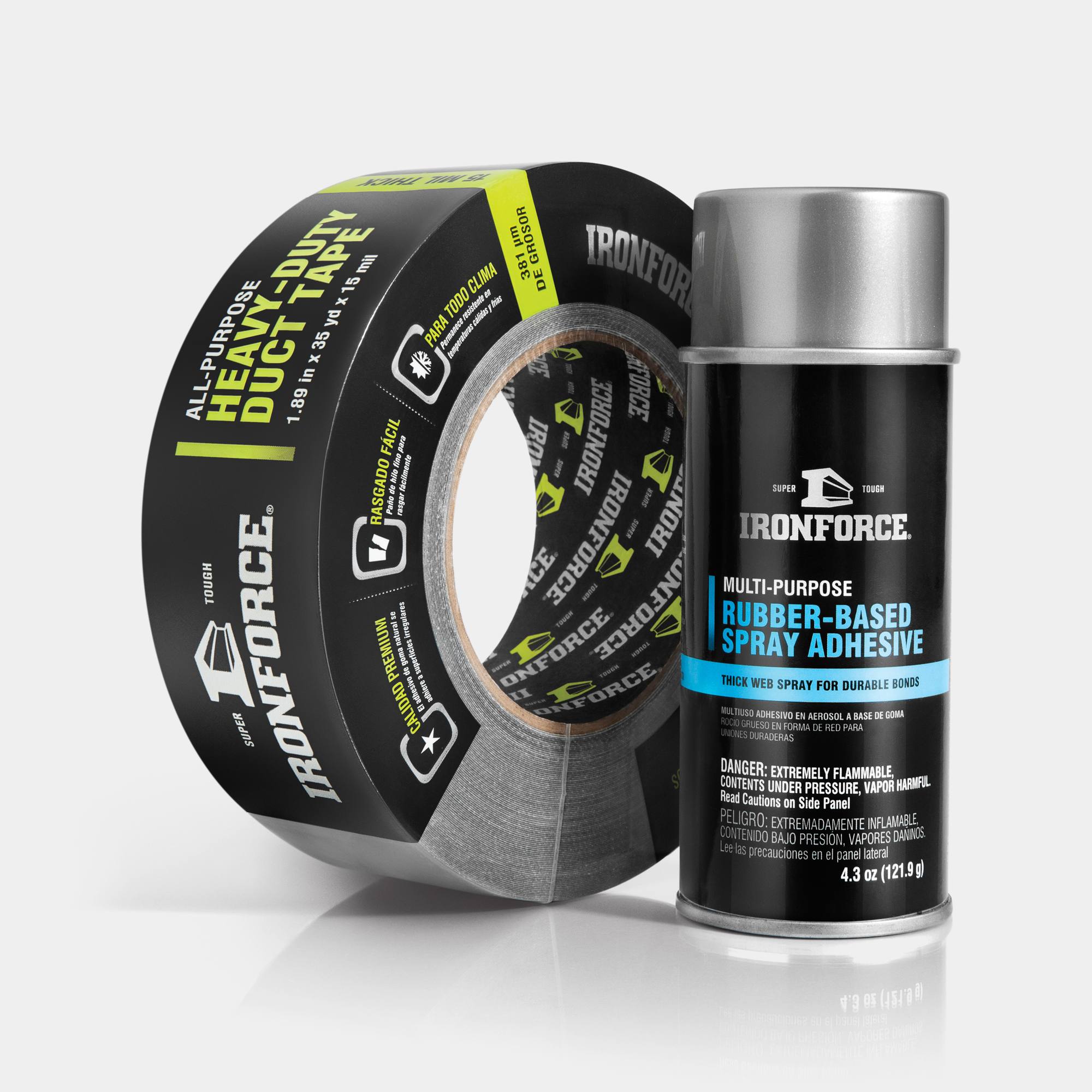
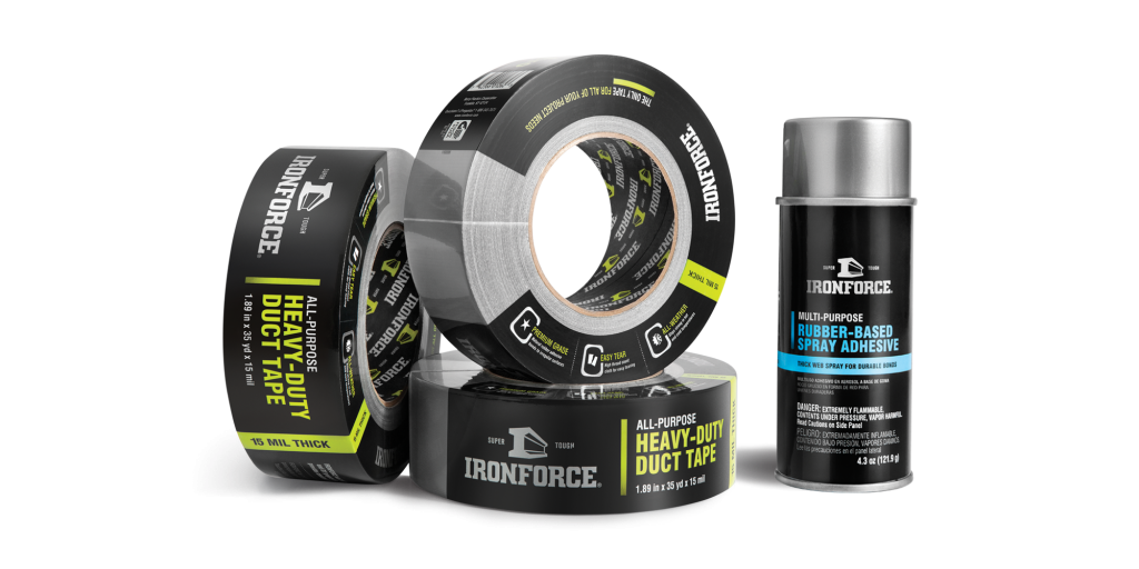
With the name and logo nailed down, we dove into package design. We explored concepts inspired by classic toolboxes and contractor-grade tools. However, the idea that won all of our hearts and minds was a concept inspired by Porsche, one that evoked engineered excellence, sleekness and prestige, coupled with hints of neon.
From our initial meeting with Berry Global, we became consumers of adhesive products in anticipation of developing key messaging for IRONFORCE. It’s a process by which we determine table stakes, the competition and the products’ top selling features.
With a fully developed brand identity and key messaging, IRONFORCE then rolled out a sales-driving website with the new look and feel of the packaging. The site also features a video that was written, shot and directed by our team. It quickly educates consumers on the products and entices them to head to The Home Depot. These two assets rounded out the IRONFORCE project and really helped to establish its new identity in the marketplace.
In the first few months of the launch, IRONFORCE was one of the top selling tapes in the plumbing department for The Home Depot. Today, it can still be found on the shelf and continues to be a good seller.