
Have you ever been drawn to a certain color of paint for your home or felt a certain way about a product just because of its color? This isn’t just by chance; it’s a result of color’s impact on our feelings and is all about color psychology. In home improvement marketing, this fact is no less true. Whatever your brand colors are, they make the consumer feel something, so what do you want them to feel? Knowing how to use color psychology is necessary for communicating what your brand stands for, enabling your brand to stand apart from its competitors and determining how consumers feel about it. Let’s look into how color psychology can help you make your mark in the home improvement industry.

How Color Affects Us
Color isn’t just something you see; it affects emotions and moods and can sway up to 85% of your buying choices. Different colors can make us feel various emotions. For example, some colors can make us feel excited and energetic, while others can calm us down and make us trust more. Also, colors mean different things in different cultures. This shows why it’s so important to think carefully about the colors you use for your brand.
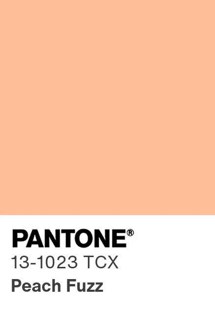
For instance, take 13-1023, 2024’s Pantone Color of the Year, better known as Peach Fuzz. It’s more than just a pleasant shade or a trend: It evokes a sense of warmth and comfort, qualities coveted in home environments. Applying it to a home improvement brand might lend itself to a lifestyle brand or an advertising campaign emphasizing how the advertised products bring people together. On the other hand, if you’re advertising for tools or hardware, Peach Fuzz might not be the best choice.
The Power of Color Ownership
But color psychology goes beyond simply using colors that evoke certain emotions. There’s a whole other level of brand recognition achieved when a brand so effectively utilizes color that the color itself becomes synonymous with the brand. Think Coca-Cola red, McDonald’s yellow, Starbucks green, The Home Depot orange, UPS brown, Tiffany blue – the list goes on!
These brands have strategically used color consistency across their logos, marketing materials and even store designs. Over time, this consistent use has conditioned consumers to associate the color with the brand, even in the absence of any logos or branding elements. Studies have shown that consumers can recognize a brand based solely on a color with a remarkable degree of accuracy.
Owning a Color in the Home Improvement Industry
While achieving iconic color status like Coca-Cola red might seem like a distant dream for many brands, there are inspiring examples within the home improvement industry that demonstrate the power of color ownership:
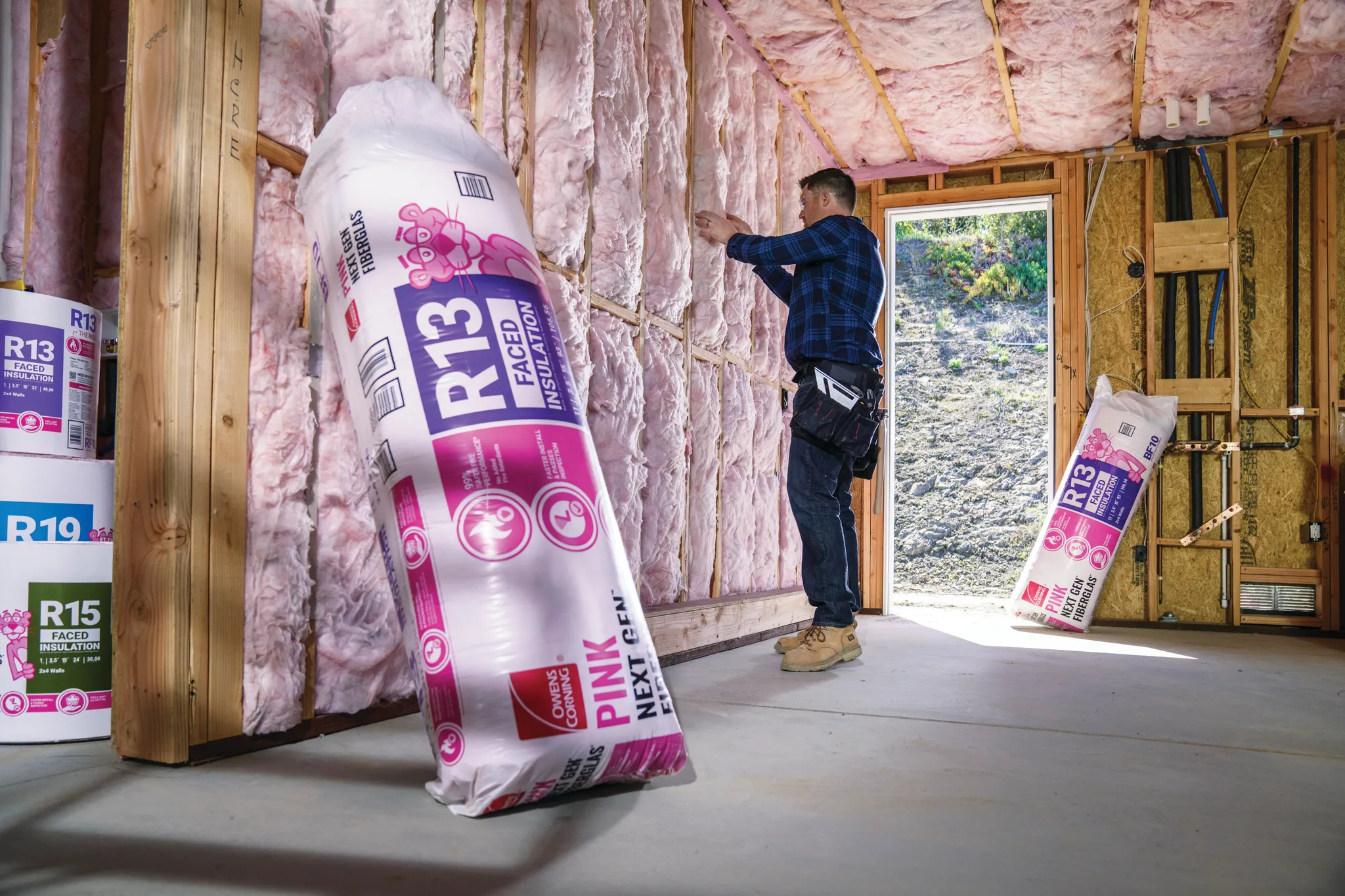
Owens Corning Pink: This bright pink isn’t just eye-catching, it’s become synonymous with the brand. Introduced in 1956 for their insulation marketing campaign, the color became such a powerful tool that they trademarked it in 1985. The playful pink, often paired with their mascot the Pink Panther, evokes a sense of comfort and security, aligning perfectly with the brand’s message of reliable insulation for your home.
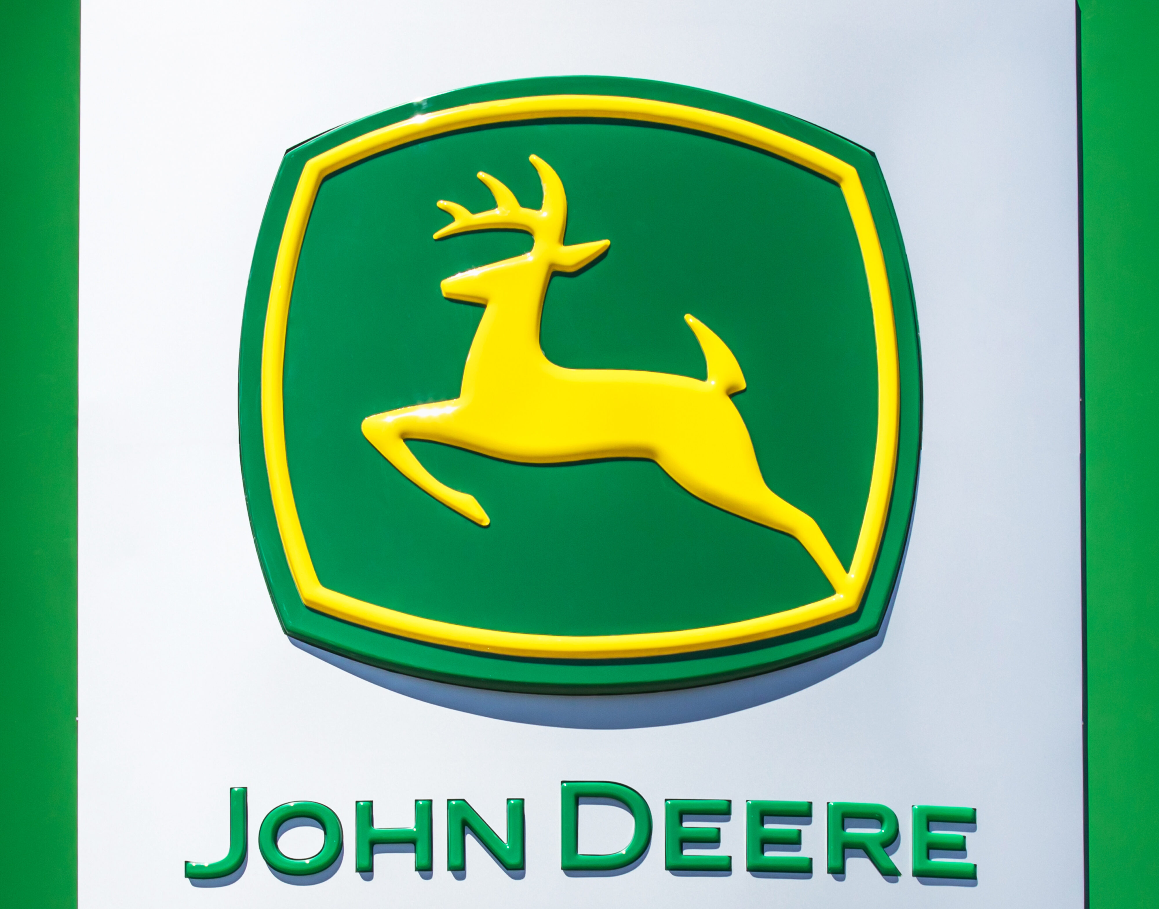
John Deere Green: John Deere green is so ingrained in the home improvement world that there are country songs written about it and a specialty touch-up spray paint readily available. This deep green goes beyond mere aesthetics; it communicates growth, stability and the rich heritage of the brand – all qualities that resonate with homeowners seeking dependable equipment.
Beyond the Obvious: Colors that Evoke Luxury and Trust
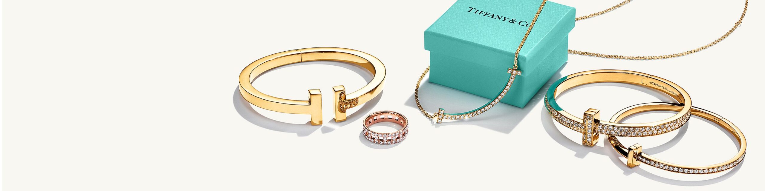
Color ownership isn’t limited to bold or traditionally “masculine” colors. Consider Tiffany & Co.’s robin’s egg blue. While the color might have originally evoked calmness and purity, through consistent brand application, it now instantly signifies luxury and pampering. This demonstrates the power of consistent color usage in shaping brand perception.
Creating Your Color Palette
While it’s good to know what certain colors usually mean, the best color scheme fits your brand’s unique personality and connects with your target audience. You aim for a color combination that delivers your brand’s message and values.
When it comes to using colors wisely, here’s how you can use color psychology to boost your home improvement brand:
- Logo and Brand Identity: Your logo and brand colors are usually the first things people notice. Choosing colors that show what your brand is all about is crucial. If your company is all about outdoor services, use greens and blues to represent nature and calm. But if you’re selling powerful tools, bright reds and oranges could be better to show energy and innovation.
- Online Presence and Marketing: The colors on your website and marketing materials are important in guiding potential customers. Using colors wisely can spotlight key actions, set the right mood, and make the customer experience enjoyable and smooth.
- Product Packaging and Design: The colors you pick for your products and their packaging can affect how people see them. Choosing colors that fit your brand’s needs can make your products more appealing.
Starting Your Color Adventure
Exploring color psychology is a continuous journey filled with chances for creativity and making meaningful connections. With the right strategy, color can be a standout tool in making your brand memorable and engaging for customers.
By implementing these steps, you can begin to establish your own unique color identity within the home improvement industry. Remember, color is a powerful marketing tool. Use it wisely to build brand recognition, trust and, ultimately, customer loyalty. If you’re ready to improve your brand’s color strategy and leave a lasting impression in the home improvement industry, Porchlight is here to help.
