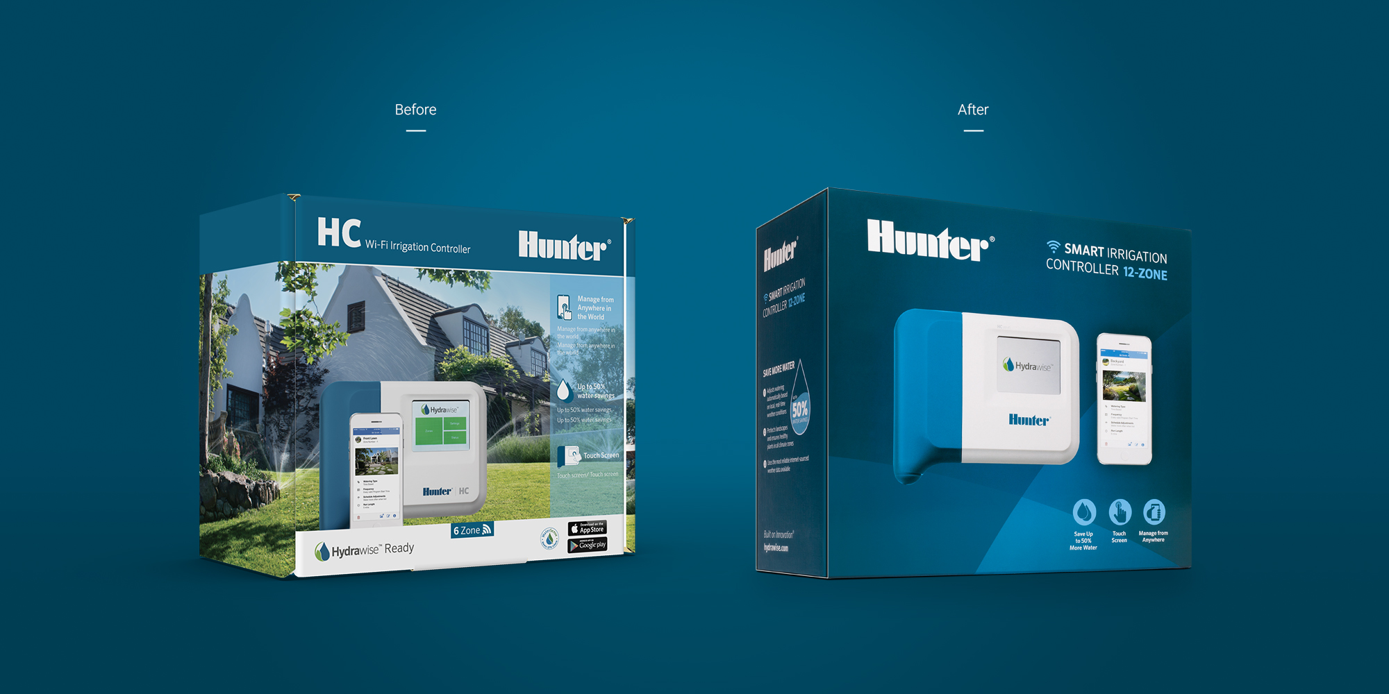
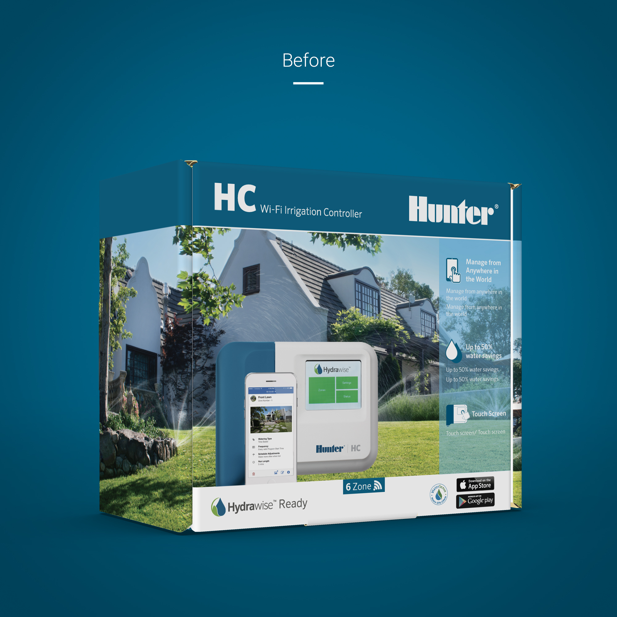
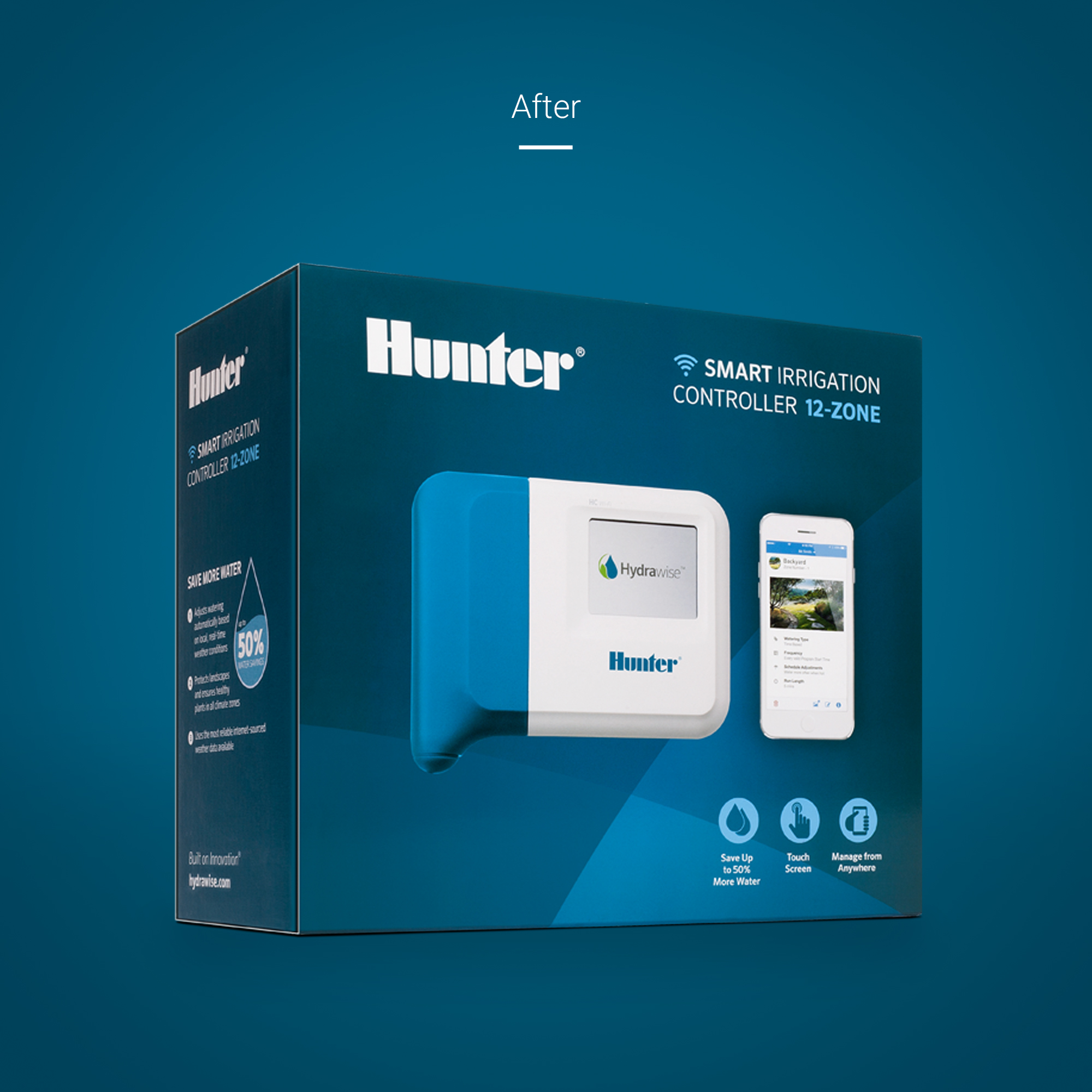
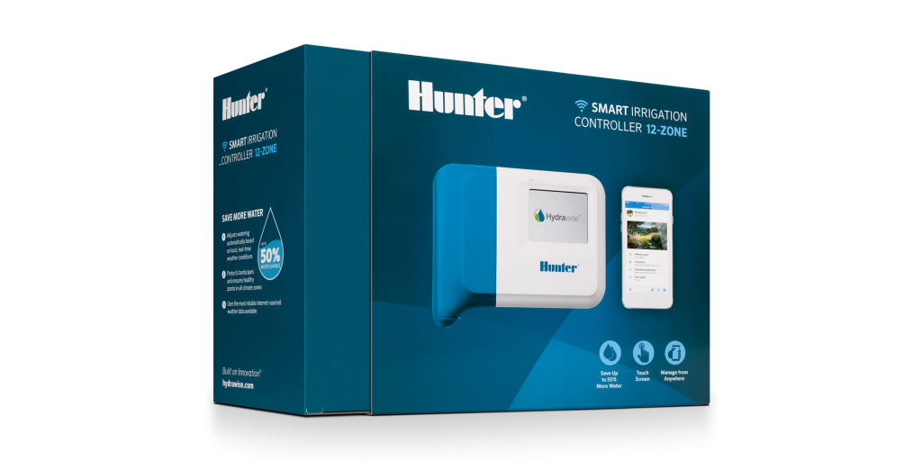
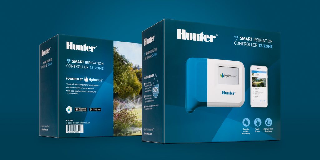
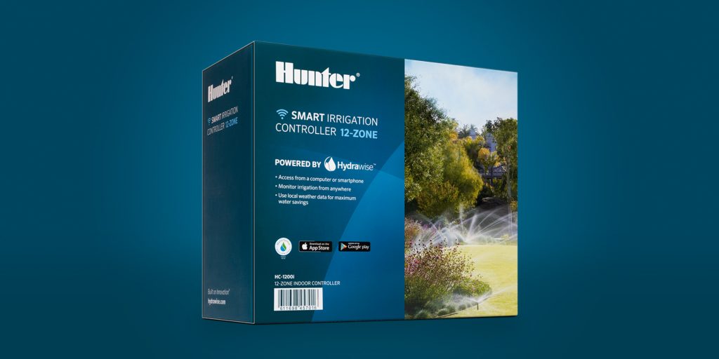
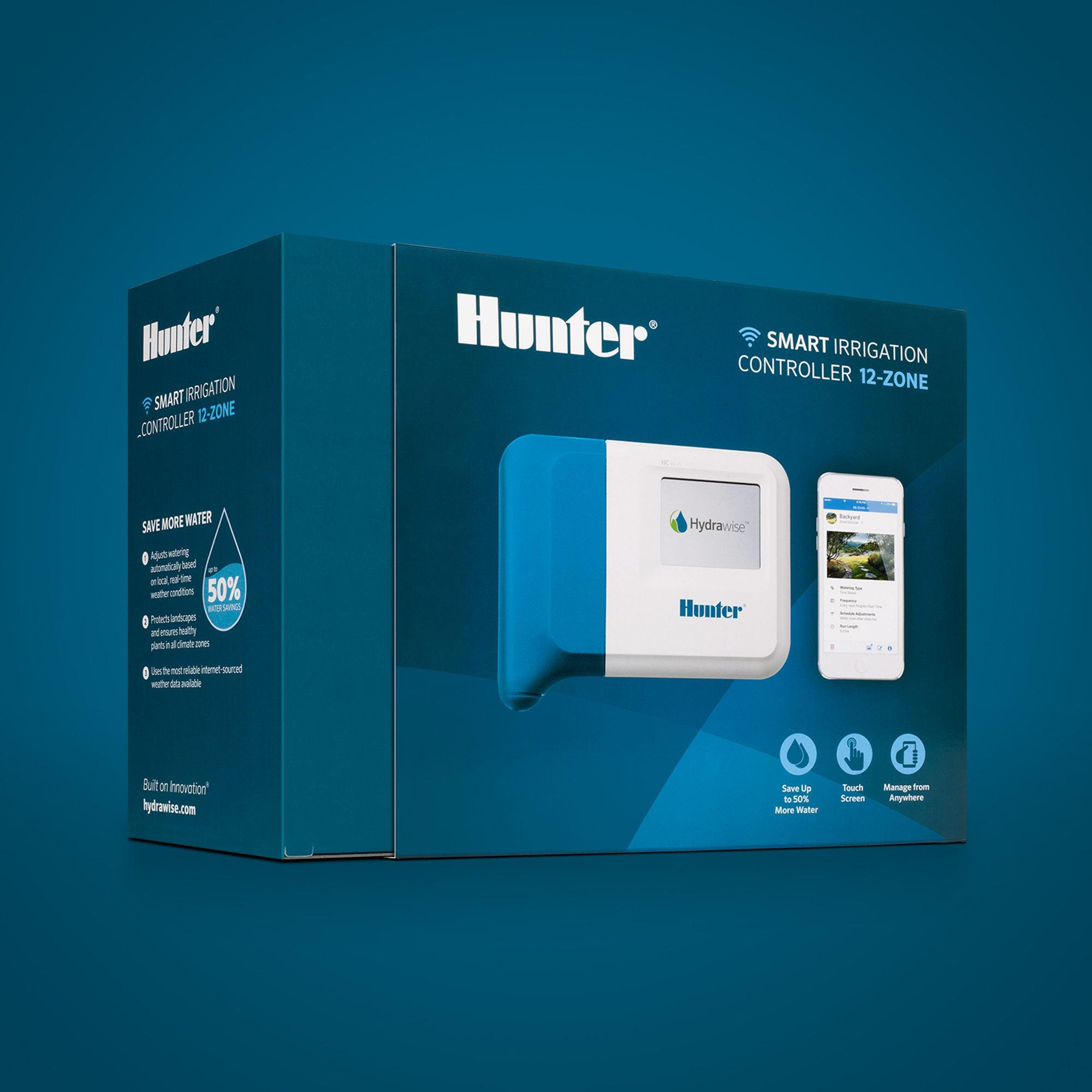
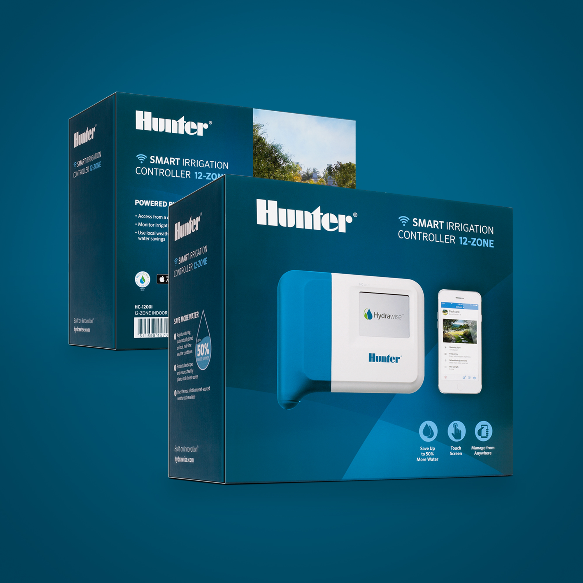
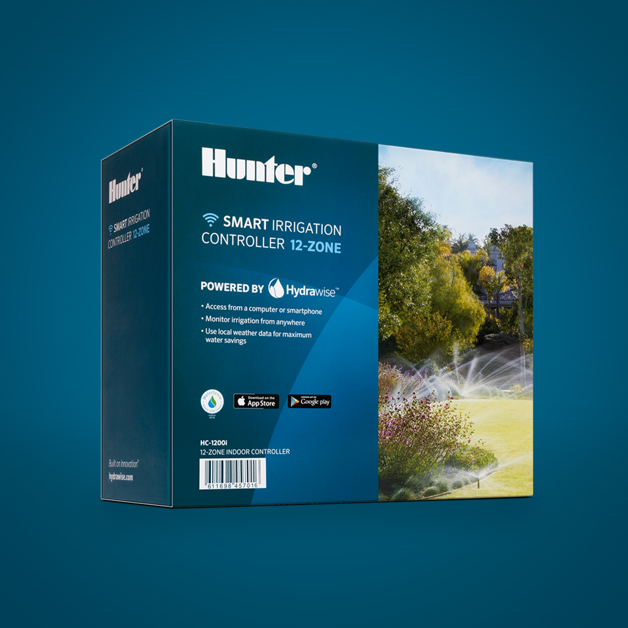
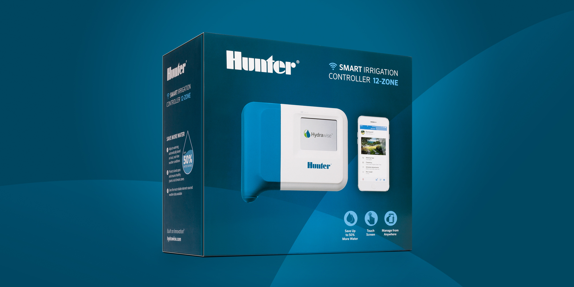
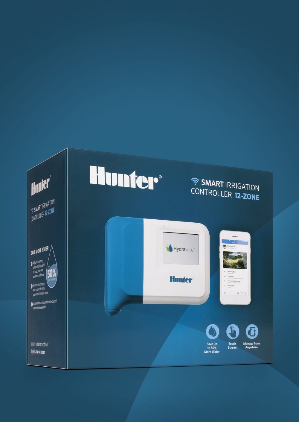
This was our first time partnering with Hunter Industries and their corporate creative team, so we were eager to get to work. Their HC irrigation product is high-tech and includes features that the competition doesn’t. Our goal was to ensure the features/benefits were clearly portrayed, and the box stood out on the shelf amongst the competition.
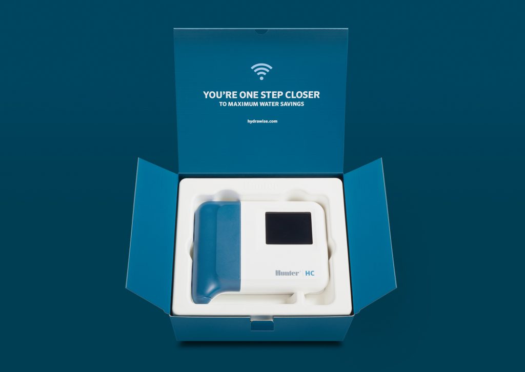
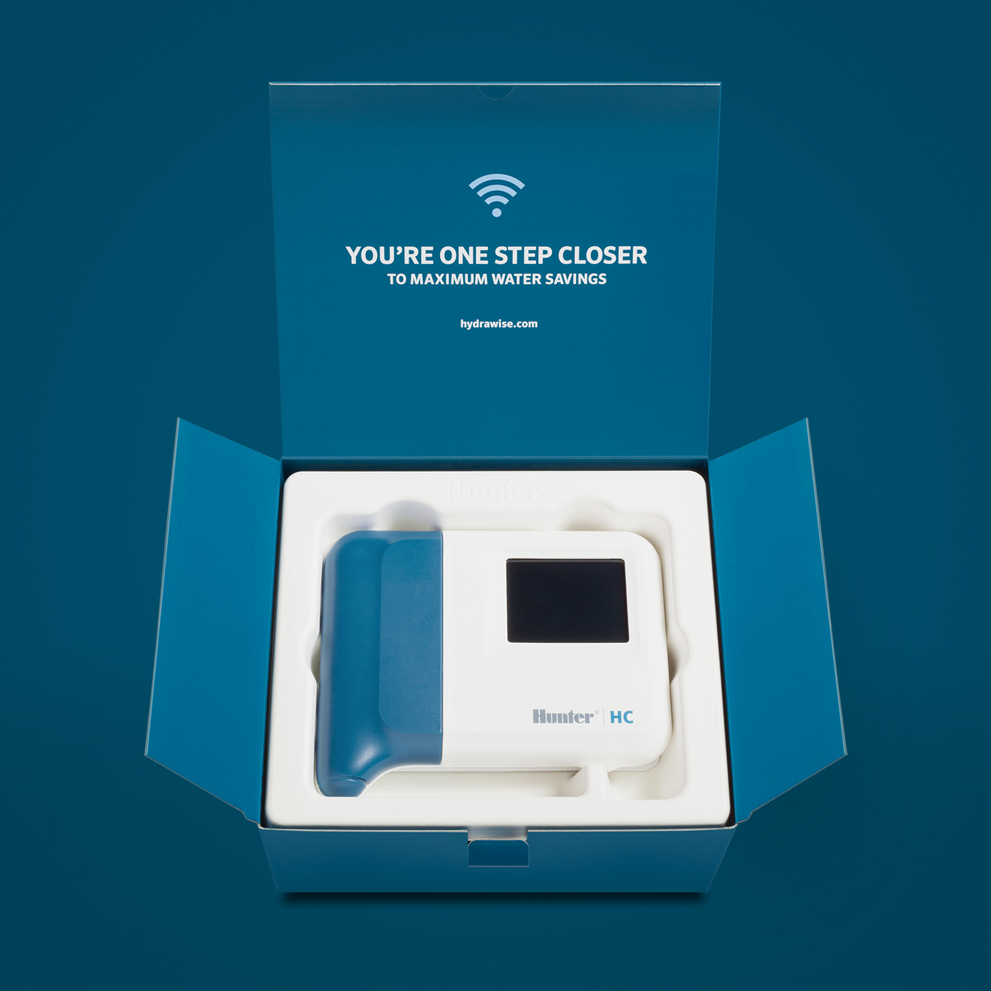
We started off making the entire package Hunter’s blue color and isolating the Hunter name to make the brand more prominent. Since this product is a higher price point and at the top of the product lineup, we altered the box structure and added a sleeve/wrap with a special finish to clearly portray it as a premium product. We also created consistent iconography with more descriptive titles to make the whole message more cohesive.
Overall, Hunter’s corporate creative team was extremely pleased with the end result. We provided them with creative which resulted in a much simpler – yet captivating – packaging design that enabled customers to more clearly understand exactly what the product was capable of compared to the competition.
Join Our Newsletter
Subscribe for exclusive marketing tips, industry trends, and strategies to grow your business. Get ahead of the competition!