Brand Positioning

When we talk about brand positioning, we are looking for the “where” of your brand or product. Where does your brand stand in the market and in relation to the needs of shoppers? Positioning is about orientation, and unless you have some real estate to build on, you will struggle to get noticed. If you’re positioned in that shadow of someone else, you’ll also struggle to grow. Find a position you can call your own. We can help.


Brand Identity

Brand identity refers to the “who” and “why” behind your brand or product. What does your brand represent, and how does that manifest into an experience? Too often, brands fall into archetypes rather than authentic identities. This results in a flat, forgettable brand experience. When you invest in a rich, well-defined and individual identity, the rewards are immediate. Decisions, actions, standards and touch points fall into place easily, and shoppers respond.


Brand Standards

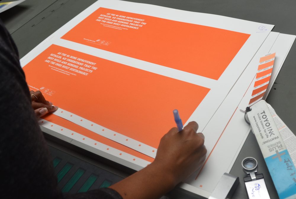
With positioning and identity in place, brand standards bring your brand to life. Brand standards provide specifications and visuals needed to equip your brand for any scenario, from visual merchandising to ecommerce. Brand standards ensure consistency and accuracy by providing a platform on which your brand can grow.


Key Messaging

In addition to developing a unique brand voice, our writers help define the right vocabulary and messages to inspire action. Whether for a campaign, branded collateral or ongoing brand experience, we develop key messages to communicate what makes your offering unique and compelling.


Lauren Batts

Marketing Manager at hansgrohe

At hansgrohe, we were looking for a full-service marketing agency to assist with creating beautiful assets for our newest product launch. Porchlight brought the expertise and creative eye to the table. It was great working with the entire Porchlight team from start to finish to bring our newest collection to life through photography and video.

Hunter Industries

This was our first time partnering with Hunter Industries and their corporate creative team, so we were eager to get to work. Their HC irrigation product is high-tech and includes features that the competition doesn’t. Our goal was to ensure the features/benefits were clearly portrayed, and the box stood out on the shelf amongst the competition.

We started off making the entire package Hunter’s blue color and isolating the Hunter name to make the brand more prominent. Since this product is a higher price point and at the top of the product lineup, we altered the box structure and added a sleeve/wrap with a special finish to clearly portray it as a premium product. We also created consistent iconography with more descriptive titles to make the whole message more cohesive.

Overall, Hunter’s corporate creative team was extremely pleased with the end result. We provided them with creative which resulted in a much simpler – yet captivating – packaging design that enabled customers to more clearly understand exactly what the product was capable of compared to the competition.


Read the Case Study

Iron-Hold

Berry Plastics originally wanted us to get their Iron-Hold trash bags color family consistent, but they quickly added onto that by having us do slight revisions to their opening price point/inexpensive packaging. After seeing what a big difference the slight changes made, they then wanted to see all-new creative.

The main challenge was the overall design was trying to carry more weight than the typical opening price point trash bag. But we didn’t want it to connect with any of the national brand names either. They also did not have any logo or color palette consistency. We ended up doing three versions of three different families of product, with each family organized by color for its gallon size. We did versions that were close to the original and others that were totally new. We also made slight revisions to the logo and even did a full photoshoot so we could have all-new photos to choose from.

In the end, we brought them a consistent, scalable design that should last the test of time. We did everything from in-store research to structure designs to font families and brand standards, which also led to us to doing some of their trade show booths, sales sheets, coupons and digital ads.


Read the Case Study